Design System
Owner & Contributor
Deliverables
Design Library, Component Guideline

Building a new Design System from scratch in Figma, to create a scalable, consistent and accessible digital experience.
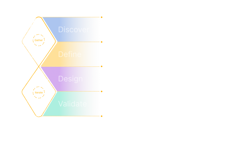
Design Approach
To build the design system, I followed a simple yet effective two-part process inspired by the Double Diamond model. I began by exploring and understanding the challenges—looking into existing design inconsistencies, conducting interviews with various product & development teams, and identifying what needed improvement. Then, I moved on to creating solutions—designing reusable components, setting up design principles, and building a system that’s scalable and easy to use. As the foundational, atomic, and molecule-level components were gradually rolled out, the team actively invited feedback and questions to support timely iterations and continuous improvements to the system.
Discovery
In the discovery stage, my aim is to gather feedback from the product and development team. As well as their need and pain-point. I’ve conducted a few interview/catchup with multiple roles from different squad to identify the problem they’re facing.
”I do not have a place to reference If I am building the right design
”It’ll be great if components are shared across product by maintaining 1 single design component library
”Where do I find a design guideline?
”The existing design do not have a proper guideline that I can reference
”I need to use my own judgement to make sure that I’m developing it in the right way
Challenges
Designer do not have a proper library where components are able to drag & drop or reuse. Will need to re-create the design over again or browse through multiple design files to find the components, making it hard to define which component is the correct one to follow and it’s time consuming.
Components are created in separate local design files due to uncertainties of whether the components are able to reuse in future.
Misalignment between design and development due to lacking of design guideline, interactions and component specs.
Developers are unsure of which components that should be used in the projects. Therefore the duplicates of components with different specs are built in library.
Problem to solve
To summarize the findings into “How can we solve”
How can we solve
Structure and organize the design system so that users are able to find the correct component easily.
How can we solve
Deliver a clear guideline to designers & developers so that there will be no misalignment between design and developers.
How can we solve
Create a design system applicable for all the products.
How can we solve
Create components that have potential future variables to used based on the product, feature and product end goal.
Design and Validation
Before starting with the design phase, I created a design plan to identify the component foundation, prioritisation of components and timeline. This is to set expectations for the stake holders and working concurrently with developers where they’re able to update and clean up the design library while I expand the design components into further variables.
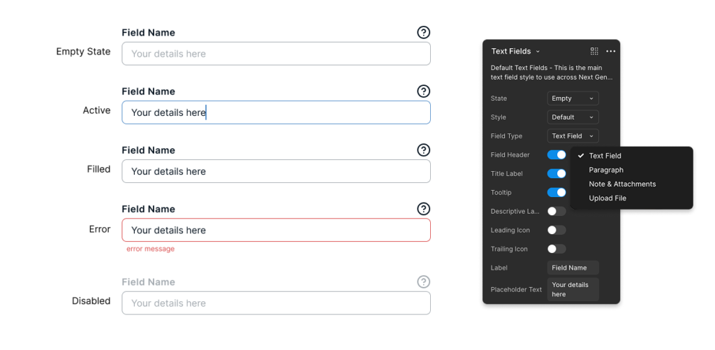
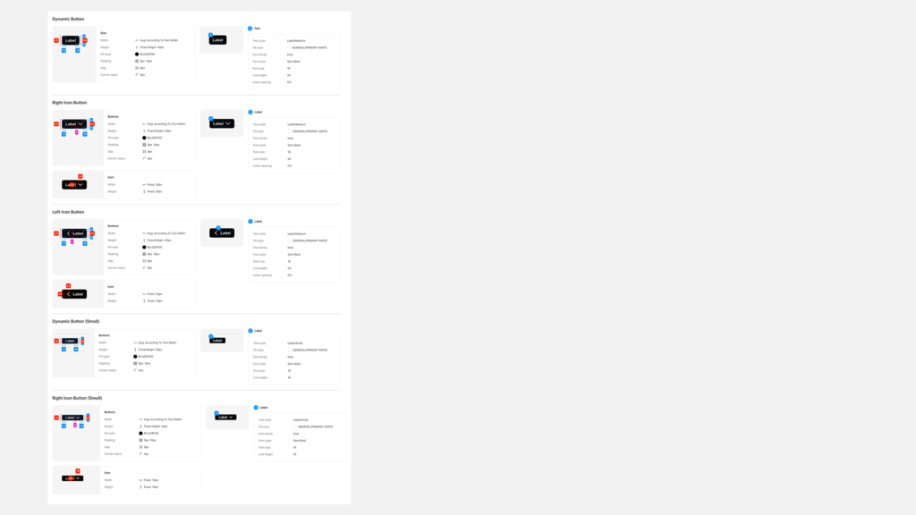
Configurable
Designers can now effortlessly and intuitively configure components within Figma. For instance, designers can access the preferred variations through the variant panel. Which includes the ability to set component and text properties. Designers can now configure all component variations from a centralised location
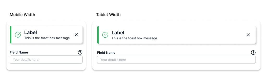
Scalable
All components within the design system are now seamlessly scalable across various view. From mobile to wide screens, designers can utilize the components to create interface on any desired screen size.
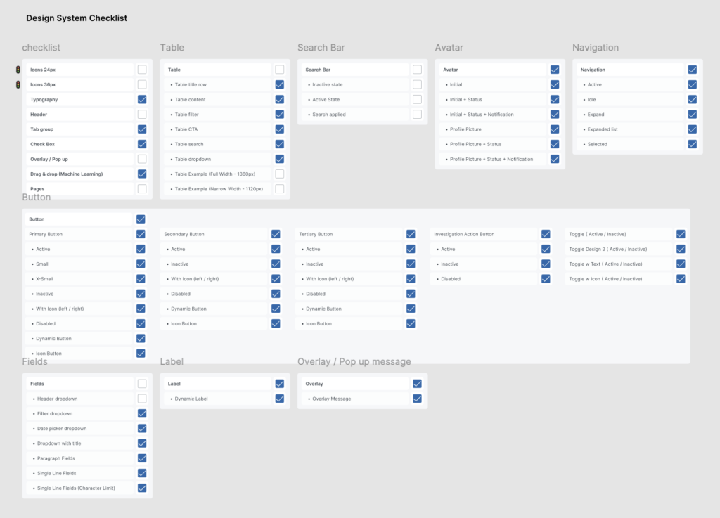
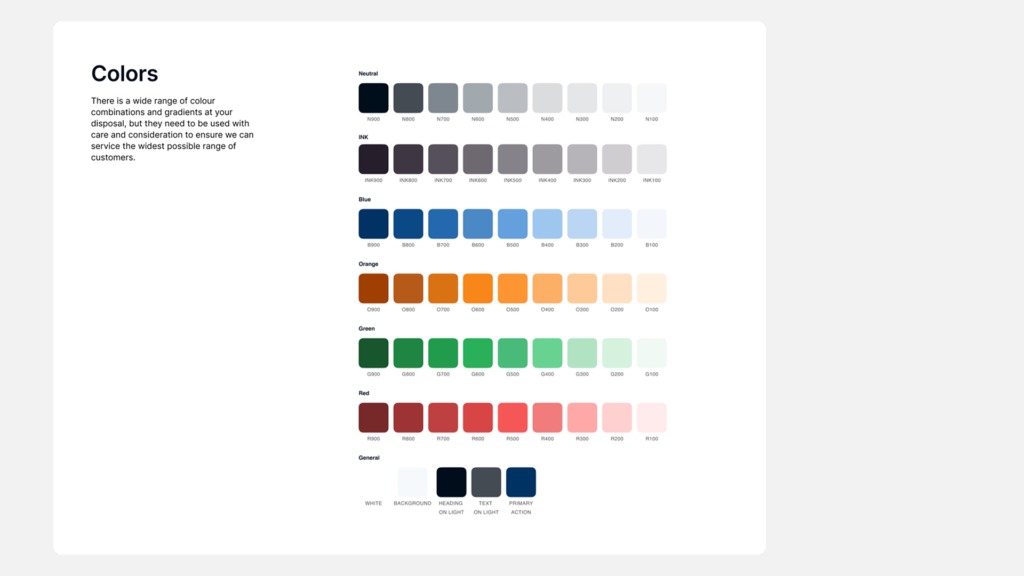
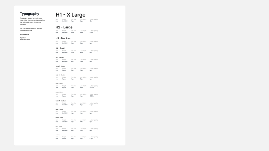
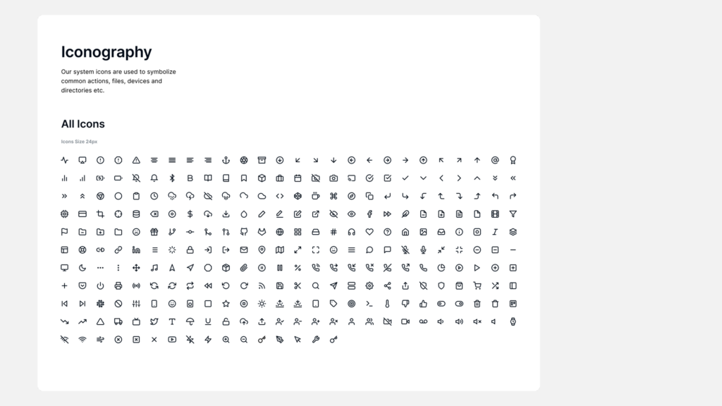
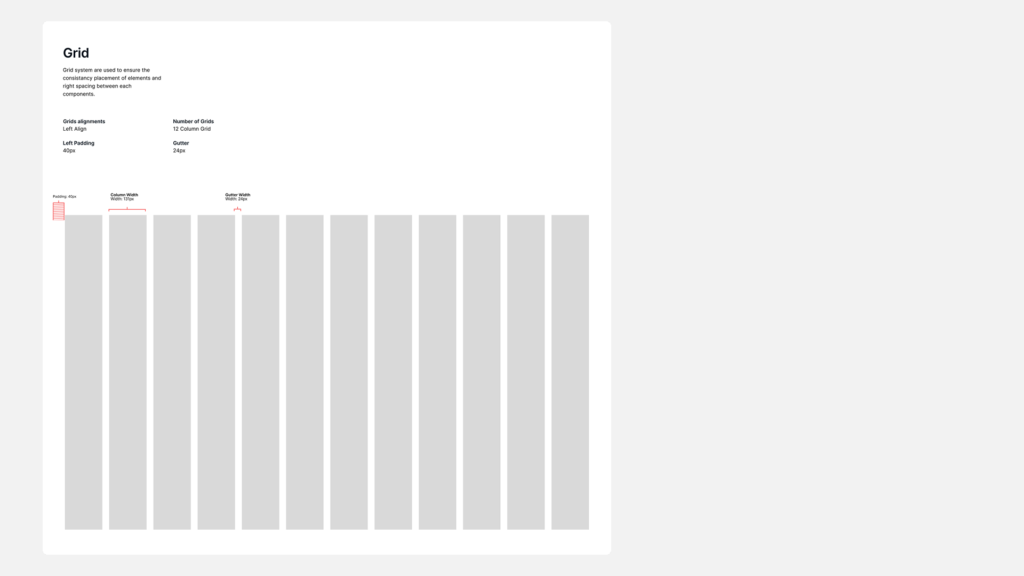
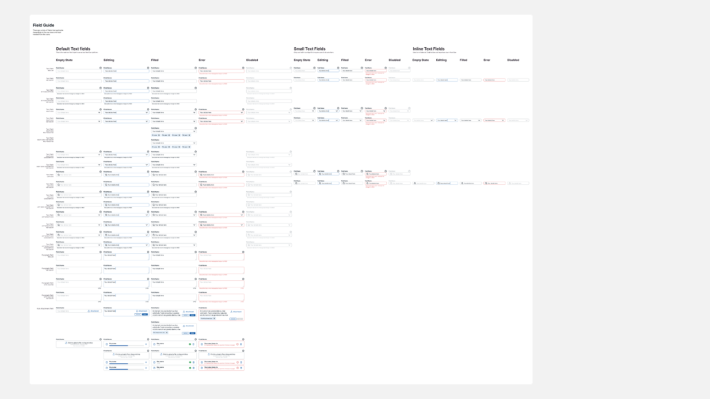
Design System Structure and Specs
Design components are structured within the Figma Master Component library, starting with design specs and guideline on system usage. The final section includes documenting additional information in supporting information such as wireframes etc. This design system will be maintain and updated from time to time in order to cater new design components.
Achievement
80%
Design Time Saved
90
Design Consistency Achieved
100
Knows where for references